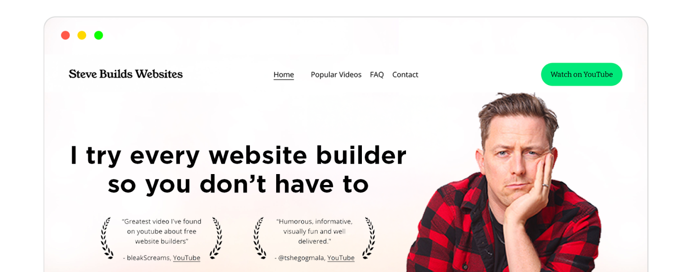
Best Website Builder
I test every website builder so you don’t have to. These are my rankings of the best website builders for 2026.
Our work is supported by affiliate commissions. Learn More
Last Updated June 4 2026
We have analyzed thousands of portfolio websites and gathered hundreds of well-designed ones for our different website example collections:
This a collection of the best of those, i.e., this is a collection of the best of the best portfolio websites.
Tip: Use ← and → arrow keys to browse.
Type: Marketing agency portfolio website
RyuCreative is a boutique-style marketing agency in Los Angeles. The female-run company has successfully assisted several different companies in PR, Social Branding, and Creative Design.
How they have gone about their homepage is unique, but it will not alienate the potential clients. Firstly, people will know it’s a creative agency from its name. Besides, even if the randomly spread images on the homepage create a mystery about their business, users will find what exactly they do as soon as they scroll.
If we discuss their portfolio page specifically, Ryu has structured it differently than most agencies. First, the visitor has to select the portfolio category from four options (their primary services): Social Elevation, Content Creation, PR + Events, and Graphic Design.
Each portfolio category page/landing page uses a different but beautiful design template and has excellent images + concise descriptions of all the items in the portfolio. For example, this is the Social Elevation portfolio page—the negative space and unconventional layout pop up the work blocks:
Type: Creative director & designer portfolio
Currently located in Los Angeles, visual artist and designer Mindy Nguyen helps brands with identity, art direction, web design, etc. She freelances and also works with ilovecreatives Studio.
Her website homepage is her About + Portfolio page. Above the fold, she describes what she does with a good font, concise copy, and cool animations.
As soon as the short bio ends, you’ll find her works, i.e., her online portfolio. Each portfolio item includes four things: an image, the company’s name, what she did for the company, and a link to either see the live project or learn more about the project.
She presents everything neatly with negative space, proper visual hierarchy, and emojis.
Type: Designer & Photographer portfolio site
Meiwen is a professional photographer who features travel, people, editorial, and interior photography. He is also a designer, combining his many artistic talents to help his clients with branding, art direction, and more.
His portfolio website is minimalistic. On the homepage, he has gone with two main things: a short bio and a portfolio with a few featured items from both his design and photography works. The minimal navigation bar helps visitors find more of his portfolio items, the contact form, or the primary social media profiles (Behance, Instagram, and Pinterest).
He also has separate portfolio pages for design and photography. For example, potential clients interested in his photography can click on “photographer” in the navigation bar to see his photography portfolio, where Meiwen has organized his photos in a gorgeous four-column layout:
Type: Photography portfolio site
Mike Kelley is a photographer located in California. You can view his excellent work that is focused on architecture, as well as his love for airplanes. He loves the world of art and design and merging these into his projects.
The website is clean, with the homepage divided into two columns: The main section showcases Mike’s works (i.e., it’s his featured portfolio). The left column helps visitors navigate different parts of the website - his work portfolio in a particular sector, the ecommerce store where he sells portraits, the About page, the contact page, etc.
The portfolio page layout is your typical four-column grid where he has uploaded his photographs:
Type: Photography portfolio
Levon Biss is an award-winning photographer in London. He has some authentic and gorgeous macro photography work, primarily of insects. His work has been published in TIME magazine, The New York Times Magazine, National Geographic, Sports Illustrated, and many other respected international titles.
The homepage of this website is the main photography portfolio page. It showcases photos in a masonry grid. Visitors can click on each image to learn more about the photo project.
The website also has separate portfolio pages for each category of Levon’s work (people, macros, prints, etc.) for visitors who want to see a specific type of photography.
Type: Wedding photography portfolio
Rob Jinks offers wedding, engagement, and family photography that captures meaningful moments. This website feels both classy and adventurous. It also showcases his work and clearly defines his services.
The website is sort of a small business website-cum-portfolio website. It has service pages, a portfolio, an about page, a blog, lovely testimonials, and a CTA to “Request Pricing + Availability.” Also, of course, the hero of the website — the photography — is well highlighted all over landing pages.
I really like Rob’s portfolio arrangement. He has stacked each photo one below the other. This way, the potential client sees not only the photography quality but also the photo quality without having to open each photo for zooming.
Type: Art portfolio
Samantha is an artist currently working in Brooklyn, New York. Her paintings of people and the world around her have a unique way of connecting with viewers psychologically.
The personal portfolio looks a bit dated but does what a portfolio website should: present her best work categorically and structurally. The first portfolio page has her latest works (2015-2022), which you can scroll through or leave to see her older works or works in a particular category (Portraits or Ariel).
Type: Photography portfolio
Israel has a passion for photography, documentaries, and editorial images. He works alongside his wife, who provides makeup and beauty services to clients, while Israel captures the day being played out. They have three children and live in Mexico currently.
The website looks sleek, with (surprise, surprise!) professional-grade photography and minimal typography. There’s one small problem, though: Because most of the photos on the homepage are white-ish, the white text menu items are barely visible at first, which is something you’d want to avoid to create a good first impression. However, as you scroll, the header background transforms into black, which solves the visibility problem.
You can see his portfolio in two views: The default is a four-column masonry layout where you scroll through his works using the typical vertical scroll. However, when you click on any of the images to enlarge, the view changes to a horizontal scroll portfolio; in this view, you can see photos in a larger size and scroll horizontally to see more.
Type: Interior design agency portfolio
Studio Anton is an interior design firm based in Cambridge. Their work stands out for its clean style and careful planning, creating spaces that look great and feel right for their clients.
The Studio Anton website is a great example of their design approach. It uses a simple, minimalist layout that puts their work front and center, with high-quality images showing off what they do best. The colors are muted, the navigation is easy, and testimonials are right where you need them. Moreover, the short ‘about’ section quickly explains their design philosophy.
You see their portfolio as soon as you land on the site, since the homepage is the Portfolio page. Hover over any project name to get a full-screen preview of the finished interiors.
Clicking on any portfolio item will take you to a separate page where you can see more images and descriptions of their work for the client:
Type: Interior designer portfolio site
Avery Cox is located in Texas, where she adds a unique style that is colorful and bold to the spaces she designs. She gained experience working in New York with some big-name designers, allowing her to take what she learned and apply that to her own business.
The colorful image of a well-designed sitting room as the hero immediately captures visitors’ attention. If you don’t directly scroll, next in the visual hierarchy is the Projects link at the top-left—click it, and you’ll be on the dedicated portfolio page. But..
If you scroll down, she has added many images of her interior design work. There, too, she has placed a ‘View Projects’ CTA to drive you to see her work in detail.
The Projects page, aka her design portfolio, lists her projects in a two-column layout with big thumbnails. Clicking on any project opens an individual project page with all the details regarding the project, including images, design descriptions, quotes, related press, details of the builder, architect, photographer, etc., and more.
Type: Photography portfolio
Dylan is from France and moved to LA to follow his dreams of using his artistry. His work is now published in well-known magazines, featuring fashion, portraits, and editorial work.
His portfolio site uses a popular template of the photography portfolio-first website builder, Format. So everything’s pretty perfect as far as website elements go. There’s whitespace, proper framing, great typography, ideal website structure, social media icons in a visible and right place, etc.
Also, he has categorized his works well, which is crucial for an extensive portfolio. Plus, he is a great artist, so all the portfolio items shine.
Type: UX Portfolio
Moritz teaches UX design as a tutor at CareerFoundry and also has web design, branding, and UX projects under his cap.
His portfolio website, as he proudly puts it, was reviewed and approved by the grand Ran Segall, the founder of Flux Academy. That’s proof enough that this UX portfolio is on point. Let me just highlight the elements I like:
Formatting: Moritz’s case studies are comprehensive, with in-depth descriptions of all the steps he went through for the project (from identifying challenges and making user personas to conclusions). Yet, they are easy to follow, thanks to the formatting. Some examples:
Type: Art director & interaction designer portfolio
Lu Yu does interaction design & art direction. She was Head Of Brand at Pitch and is a Jury member of Awwwards & Digital Design award.
The fact that she is a jury member of a top professional web design and development competition body would assumably make it a given that her portfolio website will be on point. Is it? Well, let me try to evaluate it using Awwwards’ evaluation system criteria (Side Note: I don’t think I am eligible to be an Awwwards jury).
Awwwards ranks based on the following 4 criteria:
Design-wise, Lu Yu’s website is awesome:
None of the aesthetic elements interfere with usability.
On the scale of not-creative-at-all to outlandishly creative, this portfolio website has the right balance. It definitely has its own character, but the creativity never harms the usability like many super-creative sites do (many of which you can find on Awwwards itself).
I think this UX portfolio can do better with content.
Overall, Lu Yu’s site is superbly designed and made keeping usability/user experience in mind.
Type: UI designer portfolio
Okay. So. There are a few things I REALLY like about this portfolio site. And others are just FRUSTRATING. If I were judging Myriem’s skills purely based on analyzing her site, I’d say she knows how to design a great UI but fails at giving a great experience.
The Good:
Talk about putting work front and center, and Myriem’s UX/UI design portfolio nails it. Her work is presented in a neat two-column layout on the homepage. Plus, not only can you see all portfolio items, but each also has a slider of images that give an overview of her work’s results.
Moreover, she categorizes her projects to let visitors filter through: You can choose from three options — website, mobile app, and ecommerce — to see relevant works.
The top navigation is also clean - on the right is her name and designation; on the left is a noticeable CTA, links to her social media, and links to her About page and Blog page.
The Bad:
Let’s start from the top.
On top of it all, I found the loading time of this site on the higher side.
Type: Web design portfolio
Gautham Mukesh is a full-stack designer with experience in branding, development, illustration, web design, visual design, and UI/UX.
I love the landing page of this site. It has a fantastic scrolling animation that makes learning about Gautam, his projects, his processes, and contact information fun. However, I don’t like the fact that some elements that seem obviously clickable aren’t.
The case studies are also nicely written and designed. He shows the end result at the top and proceeds to describe the process of reaching there throughout the case study, which typically starts from objectives and challenges and ends with impact. One thing I’d have loved to see but isn’t on his case study pages: A link/button to see the next or previous case study at the end of each case study.
Type: Product photography portfolio
Scott Snyder is a product/object photographer based in Costa Mesa, California. His photography is clean-cut and top-of-the-line quality, as apparent from his portfolio showcase.
The professional photographer displays his best photos with plenty of negative space on the homepage. You can find more about each photography project by clicking on the associated photo: He mentions his roles in the project, what he did to successfully complete the project, about the client, and more for each photo.
Besides showcasing his work on the homepage, he has a separate Work page (i.e., a dedicated portfolio) where he has displayed more of his works beautifully in a two-column layout.
Even the overall website experience is fantastic. Scott uses easily readable fonts; the scrolling animations are on point; there’s a small ‘about me’ section; there are appropriately placed CTAs (Contact, Instagram); etc.
Type: Copywriter portfolio
Kelsey is a copy and brand messaging consultant who also provides done-for-you copywriting services. She started as a newspaper journalist and has borrowed the interview-inspired writing style from there in her copywriting career.
Her website is the perfect blend of everything a professional copywriter’s website should have.
The homepage has all the necessary elements:
The copywriter’s portfolio page is equally good.
Then, she goes into portfolio items.
Type: UX designer portfolio
Isa Pinheiro is a UX designer with experience in product design, website design, in-store design, and more. She has worked with Procter & Gamble, Young & Rubicam, Huge Singapore, etc., and is now a senior visual designer at R/GA.
Her UX portfolio looks clean and premium, defined by big images. You can see a list of her projects (with thumbnails) on the homepage and ‘Work’ page, whole case studies of her work (with large screenshots of each step), and a gallery filled with screenshots of the finished works.
She also has a store where she sells a Framer template and GameBoy Advance SP wallpapers.
Type: Architect portfolio
Douglas Cardinal studied at The University of British Columbia before moving to Texas and becoming an architecture student. His love for nature flows through his work and creates a unique flow of design.
Right as you enter his website, the tagline “Without any preconceptions, I evolve a design from the inside out, open to all possibilities.” mesmerizes you. His philosophy page is equally impressive, with mentions of his “signature style of harmonious curvilinear forms,” “understanding of architecture as a tool to better the world,” and more.
The central part: His portfolio items are placed a bit deep into the website under Work > Categories (Spiritual, Educational, Health, Museums, Masterplans, Housing, Lodging, Civic, Commercial) > Pages, but each portfolio piece is well presented with great pictures. We’d recommend keeping the portfolio items as easily accessible as possible.
Type: Graphic design portfolio
Angello Torres is a Peruvian-born, Buenos Aires-based graphic designer and art director whose avant-garde work spans branding, illustration, and poster design with a bold, information-rich “more is more” philosophy.
The graphic designer’s portfolio works because it treats the website itself as a design sample: the oversized type, muted beige base, sharp pink/olive/blue accents, pixel-like lettering, decorative symbols, and experimental layouts instantly communicate a bold graphic identity. The page still stays usable by keeping the structure simple: clear hero statement, quick service positioning, project grid, category tags, “View Project” links, archive button, bio, social links, and visible contact details.
Type: Architect portfolios
Sasaki has been in the works for over 65 years and only continues to grow. Their design style blends many different outlooks to create a forward-moving design concept with sustainability at the top.
Their website has a modern feel to it. It has fantastic fonts, amazing animations, high-quality photos, and concise copy.
On their Projects page, they have a search bar to find if you are looking for any specific architecture design project and filters if you want to look at their projects in a particular sector, region, service, or type of architecture. In addition, each project’s details include multiple well-shot photos from across the project’s premises, and each photo has a precise, well-describing caption.
Just like with the Projects section, Sasaki nails all the website’s pages. In short, if you have a big architecture firm, Sasaki’s online portfolio and website design are worth looking into.
Type: Graphic designer portfolio
Hom Sweet Hom (nice name!) is the website for showcasing Lauren Hom’s work as a designer and lettering artist specializing in marketing, lettering, murals, and food art.
The site includes her portfolio, online courses on mural painting and marketing, and a blog with advice and stories from her career.
The website design has intricate micro-animations, stunning typefaces, and a well-organized layout. The color palette is beautiful too, and so are the professionally shot pictures of the designer.
On the “Work” page, you see a visual feast of artworks presented in a mosaic of lively tiles. Hover over any piece, and you get a glimpse of the project details – like “Feed Your Soul, Illustration” – giving insight into the diverse works she has done.
Type: Product design portfolios
Daniella is a visual and product designer who helps SaaS and AI founders build story-driven brands and products.
Her style is reflected in the website, which is visually appealing and equally simple to navigate. There are big animations, but they are tasteful and on-brand, and they appear largely on hover, so they do not affect the overall experience.
Type: Interior photography portfolio
Margaret is an interior photographer based in Barrington Hills, primarily working in the Greater Chicago area and Southern Wisconsin.
Her website is professionally made, and the designer/developer has done a superb job of presenting her work, from chic typography and clean lines to scrolling animations and a beautiful green that complements her photography.
Her work is visible as soon as you land on the website, but there are also separate portfolio and project pages. All the pages have the title and a small description on the left and a scrolling gallery on the right that always remains the center of attention.
Type: Copywriter portfolio
Sally is a freelance copywriter and brand identity writer. She has worked with massive companies like Dove and SendInBlue.
Her copywriting portfolio is excellent. She has neatly displayed her work in a one-below-the-other, single-column manner. Each portfolio piece has a screenshot, the job she did for the client, and a short quote from the client.
I am pretty sure her clients must have given big testimonials, and she cut it down to the core so the website page doesn’t look cramped. That’s something to learn.
Type: Illustrator portfolio
Lisa is an illustrator and artist who has created some truly unique stuff. She loves to be bold and comical in her work and has worked for several companies bringing different projects and ideas to life.
Her portfolio projects are simply yet brilliantly showcased. For example, her illustrative design projects include only three things: 1) Client, 2) Project brief, and 3) Her output (in the form of pictures).
Type: Web designer portfolio
Náyade is a web designer and front-end developer who works out of an island called Lanzarote. Her Squarespace portfolio features screenshots of projects which she has done design, development, and, occasionally, logo design for. She also includes links to her social media.
The portfolio is no-nonsense. Each item just has a screenshot, the client’s name, and what role she played for the client. Since all her work outputs are live websites or a part of it, potential clients can see her work live by clicking on a portfolio item and visiting the client’s website.
Type: Branding and web design portfolio
WK Creative Studio is a romantic, heart-led brand and web design studio dedicated to equipping female entrepreneurs in the beauty, fashion, and lifestyle spaces with intentional, visually stunning brand identities.
Type: Concept art portfolios
Tommy Arnold is an award-winning illustrator and concept artist whose work appears in major publications and museum collections.
His website is elegant and typography-led with subtle parallax and a curated, highly polished presentation.
Type: Wedding photography portfolio
Andrew Heeley Photography caters to unconventional and alternative weddings. Yet, and smartly so, Andrew has kept the portfolio’s (and website’s as a whole) look and feel conventional:
Andrew does couples photos, wedding photos, and family photos. So, the portfolio page first asks visitors to choose the category of photos:
Once chosen, the corresponding portfolio gallery opens:
Type: Producer portfolio
Minh Ánh Pham is a Hanoian freelance film producer and director based in Ho Chi Minh City, with over a decade of production and assistant-directing experience in international projects with Warner Bros. and Netflix.
Type: Creative director portfolio
Amy Osburn is a creative director in Los Angeles with a track record across several industries. Right now, she’s at Old Navy, where she brings teams together, mentors up-and-coming creatives, and keeps projects on track.
Type: Industrial design portfolio
Giovanni Pellone is an industrial designer based in Tokyo with experience working internationally. His portfolio site gives you a quick look at his background and shows off his work through clear images and short case studies.
Type: Brand designer portfolio
Studio Bressi is an intentional branding and web design studio founded by Ana. Based in Europe and working globally, Ana specializes in crafting cohesive visual identities and custom Squarespace websites tailored for female-led creative businesses.
Type: Creative director portfolio
Rachel Guest is a seasoned creative professional with a decade-long experience in advertising. Starting at McCann Sydney, she worked with MasterCard and Coca-Cola. Later, she joined The Many in Los Angeles, collaborating with clients like VH1, Google, and Los Angeles Tourism.
Type: Student portfolio
Kayla is studying Finance and Management at the University of Pennsylvania. Her interests are in tech, sports, and music, and her projects and resume clearly display it.
Aesthetic-wise, Squarespace has the best templates to create a portfolio. Besides, it covers all other grounds - security, ecommerce, hosting, ease of use, etc.
The best portfolio websites get out of the way. Ornamentation is not necessary. Instead, whitespace should frame and showcase the photography, videos, illustrations, etc.
A portfolio should be simple — weird scrolling mechanics and loud animations might be unique, but they can also frustrate and alienate users. You should think of your portfolio website as an art gallery— pretty and austere with plenty of space to showcase the artwork.
You can use platforms like Behance or Dribble to build a free portfolio. You can even use a free website builder like Square Online to make a free portfolio website.
However, anything free has limitations.
Yes, Wix can enable you to make great portfolios. But its editor is unstructured, which can be both a blessing and a curse.