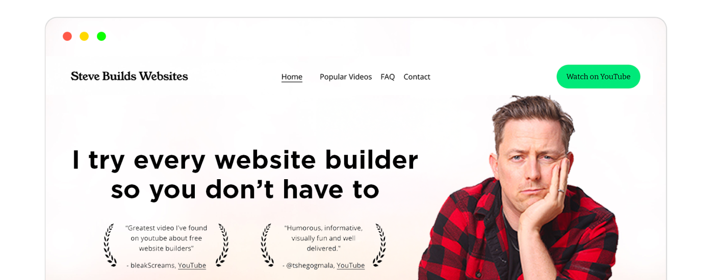
Best Website Builder
I test every website builder so you don’t have to. These are my rankings of the best website builders for 2026.
Our work is supported by affiliate commissions. Learn More
Last Updated June 5 2026
I’ve seen web designers praise fully gamified websites or websites with a lot of complex 3D animations as “WOW,” “next generation,” and “really modern.” They praise those for the art of it, the technical details of it, and the “Wow! See what’s possible!” of it.
While such websites sure are “modern websites,” they are not good modern websites. They put aesthetics over function; a good website is always ‘goal & function first, art second.’
Overall, a quality modern website has:
You can see both in these modern websites:
Tip: Use ← and → arrow keys to browse.
Margaret is an interior photographer based in Barrington Hills, primarily working in the Greater Chicago area and Southern Wisconsin.
Her website is professionally made, and the designer/developer has done a superb job of presenting her work in a modern design. It has everything from chic typography and clean lines to scrolling animations and a beautiful green that complements her photography.
Her work is visible as soon as you land on the website, but there are also separate portfolio and project pages. All the pages have a title and a short description on the left, and a scrolling gallery on the right that always remains the center of attention.
La Semilla is a modern plant‑based Latin restaurant that celebrates classic Latin dishes reimagined with vegan ingredients and creative cocktails.
It has a playful, design-forward website that stands out from typical restaurant layouts. The earthy palette, quirky typography, and strong visual identity make it feel creative and current. The booking and menu navigation remain clear. Similarly, hours, contact details, location, etc., are available on a scroll at the almost-obvious place
Avery Cox is located in Texas, where she adds a unique style that is colorful and bold to the spaces she designs. She gained experience working in New York with some big-name designers, allowing her to take what she learned and apply that to her own business.
The colorful image of a well-designed sitting room right at the top immediately captures visitors’ attention. As you scroll down, there’s some copy that can do better from font size and hierarchy viewpoint, but it’s nothing major. Below that, she has added a lot of images of her interior design work, which is fantastic for leads and conversions.
Dropps sells eco-friendly detergents, softeners, dishcloths, and other laundry and kitchen products through their Shopify store.
Their website follows the template of a typical modern-day website: full-size header image, good copy, good navigation, USPs mentioned right at the top, and minimal and relevantly-placed animations. One thing I particularly liked is their hero image — the image itself says a lot about their products.
Mack and Pouya are wedding photographers. And their website design is as beautiful as their photos.
There are lots of colors and micro-animations and sounds and photos and details going on, yet nothing about the website feels overwhelming. The font choices, the icon choices, and the overall design choice is perfect for a modern-day photography portfolio site.
Sasaki has been in the works for over 65 years and only continues to grow. Their design style blends many different outlooks to create a forward-moving design concept with sustainability at the top.
The Sasaki homepage has excellent animation, a ton of social proof, and links to all categories of their work. Visitors can learn about any of Sasaki’s projects in a couple of clicks. Plus, minor details like images slightly zooming on hover enhance the website user experience.
Benjamin is a photographer that captures some amazing images of harsh environments that’ll give you the chills just looking at them. His work is often completed in Iceland; you can find images of beautiful landscapes and animals that live in the wild.
If you visit his website, you’ll immediately notice his photography is the hero of the website. The homepage has nothing but full-size photos he clicked. Besides that, there’s just a small navigation bar that’ll take you to other essential pages.
Hom Sweet Hom (nice name!) is the website for showcasing Lauren Hom’s work as a designer and lettering artist specializing in marketing, lettering, murals, and food art.
This modern site includes her portfolio, online courses on mural painting and marketing, and a blog with advice and stories from her career. The website design has intricate micro-animations, stunning typefaces, and a well-organized layout. The color palette is beautiful too, and so are the professionally shot pictures of the designer. In short, it has all the elements of a modern, responsive website.
Devon is the Squarespace website design guru. If you need an impressive website, this is your guy. Additionally, he provides training in these departments and additional plugins that may be needed as well.
He obviously has implemented all modern web design principles for this website. For proof, notice the high-quality background video, font hierarchy, and use of animation.
You may have seen Lin-Manual Miranda in the Broadway show “Hamilton.” He is also the creator of that play and has won a ton of awards, including a Grammy, Tony, and an Emmy.
His personal website showcases who he is simply yet brilliantly. It uses a great color scheme, has great photos of him and his work, and is constantly updated with new news pieces about him and links to his work if published on OTT platforms.
CAS is an international nonprofit founded to advance cellular agriculture. They aim to scientifically farm animal products for humans to eliminate animal slaughter.
Their website is loaded with necessary information and interactive animations, but nothing feels out of place. Visitors can know everything about the project by scrolling from top to bottom. And there’s slightly different-than-normal but easy navigation too.
As you see on the home page of the website, Fat Choy is located in New York and mixes Chinese and Vegan flavors. They offer dine-in, carry-out, and outdoor dining options for their customer base right from the website.
There’s a clear CTA right at the center of the website hero section, and people can see their menu from the top menu bar. Besides, they use some modern website design elements like unique typography and custom illustrations quite well.
Feastie is a sip-and-snack festival featuring food from small businesses based in Toronto.
Their website looks and feels modern from the get-go. It has beautiful, large fonts, great colors (which are central to such food-related websites), and tasteful animations on buttons and titles.
Minna is an organic tea company selling many different tea flavors in individual cans or a variety pack. Their teas are free of the excessive sugar you’ll find in most teas yet still taste light and delicious.
The full-sized header image, the white space throughout the homepage, the CSS parallax scrolling effect, and the appropriate colorful sections…all are examples of modern-day web design trends. Also, minor details like adding nutritional facts and relevant certificates near the “Order Online” CTAs elevate the visitors’ trust in the brand.
One minor error you should avoid : The navigation text isn’t contrasting enough to the background image, so the visitors will struggle to see the “Shop Tea” link.
Happly makes THC microdose gummies that are based on science and tailored to different moods.
The design of this store is super-modern: lovely color transitions, big typefaces, some nice on-hover animations, and lovely photos of happy people. I hate how slowly it scrolls, probably because it’s a resource-heavy website—i.e., the exact things that make it “cool, modern website design” make for a bad user experience.
Lando Norris, the McLaren F1 driver, has a website that screams cool and modern. You have to look at it to know it. It was most likely made by a top Webflow agency and would have cost at least tens of thousands of dollars.
It’s not something you’d want, but it sure is cool and modern.
Charles Leclerc drives for Ferrari in F1 and has 8 victories and 55 podiums. Just like Lando’s website, this is cool and modern, and you’ll have to visit the site to experience it. It tells his story, shares his photos and records, and delivers a great website experience with horizontal scrolling, big animations, and the iconic Ferrari red.
You can figure out this beauty company as it says it all in the name. Super cool skincare products that find their color from natural fruits and are infused with other powerhouses like green tea.
This clean, D2C website focuses on just one thing: Sales! The first three sections of the website focus on selling: 1. The hero section shows the best offers. 2. Below, they have a “Most reviewed” section that showcases best-sellers. 3. Next, they have CTAs for their collections. And sections below that build social proof and uplift their brand—something that compliments the goal of the ecommerce website well.
Besides focusing on the goal, it also follows the modern website design aesthetics elements. For example, it uses a great font, a suitable color palette, high-quality product photos, a hover-to-reveal-further navigation bar, and more.
The Supernatural brand features an exciting, plant-based way to get creative in the kitchen. All of their powder products and recipes are vibrant in color, better for you, and fun to use in the kitchen!
The no-copy, no-CTA hero section gives the website a clean look. And the yellow-based color scheme matches with their packaging and ad & social media post colors, giving it consistent branding.
Inspired by and located in Kansas City, Jones Bar-B-Q is famous for its delicious flavors. The restaurant started back in 1970 and has since grown to produce sauces that can be purchased online from anywhere in the world.
For the website, they have chosen a red-based color palette that instantly gives visitors the impression of something hot or exciting.
From a hierarchical viewpoint, the first thing anyone will notice is the image of the freshly-made hot sauce. Next, they’ll read the big and bold text—SAUCE MADE WITH LOVE IN KANSAS CITY—that hints at a story behind the sauce, which is unfolded with text and great pictures as the visitor scrolls down_._ Finally, there’s a clear navigation bar and a highlighted call-to-action.
This is a perfect example of a modern website!
Angello Torres is a Peruvian-born, Buenos Aires-based graphic designer and art director whose avant-garde work spans branding, illustration, and poster design with a bold, information-rich “more is more” philosophy.
The graphic designer treats the website itself as a design sample: the oversized type, muted beige base, sharp pink/olive/blue accents, pixel-like lettering, decorative symbols, and experimental layouts instantly communicate a bold graphic identity and have a modern look. The page still stays usable by keeping the structure simple: clear hero statement, quick service positioning, project grid, category tags, “View Project” links, archive button, bio, social links, and visible contact details.
Feastables is a chocolate bar brand created by MrBeast - one of the most popular and influential YouTubers.
Its website landing page with a semi-flat design uses the classic blue and pink MrBeast color scheme. It also has all the MrBeast elements sprinkled throughout the website - massive giveaways, philanthropy, an image of Jimmy aka MrBeast, quirky reviews from Chandler and other team members, etc.
Other than the whole MrBeast branding and modern web design, the website has snappy and easy navigation, accessibility settings, a live chat/chatbot, social media buttons, logical structure, and perfectly placed CTAs.
Melula is a children’s fashion line from Denmark with a focus on shoes. Their collections are colorful, unique and aim to reflect the fun and imagination of a child.
The minimalist website is one of the best simple modern web designs I’ve seen. The landing page has a negligible amount of text and a few clickable super-high-quality images/visual designs that direct to their ecommerce store. Though there’s comparatively more going on in the Shop section, it also fits the website’s minimalist theme with lots of white space and no visible call-to-action buttons.
From a modern website design trends perspective, it perfectly fits this modern website design examples list. However, I am not sure if the website achieves the goal — sales & conversions — efficiently.
Allbirds sells men’s, women’s, and kid’s super comfy casual shoes. They are made with natural materials like wool and offer a unique style choice.
Their website features excellent copy, really good images, and a natural flow for potential buyers. Plus, everything is optimized for conversions — for example, notice the navigation bar: each link is to a commercial page; the navigation to non-commercial pages like the contact or about page is placed in the footer.
They also have great remarketing in-store: Whenever a visitor visits a product page but doesn’t buy the product, they are shown those products under “Take Another Look” right at the top of the homepage (whether the visitor is logged in or not).
OnHand supports businesses with sustainability goals by encouraging employees to take part in small volunteering projects.
OnHand’s website uses bright yellow and playful graphics to create an energetic look focused on corporate volunteering and sustainability. An interactive smartphone mockup shows how flexible the platform is. The “Dive into real-time reporting” section, with its dynamic charts and numbers, gives a clear idea of what the platform can do and highlights its value.
This company offers stylish boot options for both men and women. Their goal was to not only create durable footwear but to have styles that fit into many occasions. They are perfect for work and for casual days on the street.
Though the controllable slideshow images at the top do not quite fit the “modern website design trends,” they compensate for it with great full-size images, a user-friendly navigation menu, and nifty animations.
Oishii is a Japanese-based company featuring the Omakase Berry. The company prides itself on quality over quantity berry farming available at their locations in New York, LA, or New Jersey.
On their website, they use a fast-loading, high-quality, full-size background video for the hero section. The video showcases the freshness and the quality of the berry, which demands the visitor to react: ‘Nice! I want that!’.
Apart from the video, they have a fantastic copy, consistent color scheme, lovely images, and well-placed action buttons.
MANA Yerba Mate drinks are organic, sparkling, air-dried yerba mate beverages containing 120 mg of caffeine, 13 to 15 g of sugar, and 50 to 60 calories per can.
The branding on this and its website design are super stylish. The scrolling animation on the site is so sophisticated that you’d better not check it if you plan to build a small ecommerce site and don’t have a big budget for the website. It’s modern in the way that says “here’s what possible in a modern-day website”.
Alexis Johnson is a self-taught artist located in Minnesota. Her illustrations primarily consist of ink, but she occasionally works with other materials like pastels. She continues her own education by exploring different forms of art with every new project she completes.
Her art portfolio website is minimalistic. On the homepage, she has embedded a gallery of her art—you can click on photos to know more about the pieces. Apart from that, you can navigate to the only two pages on the website—About and Contact—from the navigation menu.
Let’s end the list with Squarespace - the website builder that many websites in this “modern web design inspiration” listicle use.
Obviously, Squarespace understands web design. And I am sure they would’ve explored every modern design and conversion rate optimization idea for building their website through which they sell their website-building SaaS.
On the homepage hero section, there’s a full-screen image and a GIF that showcases the results (i.e., the kind of website) you’ll get by using their product. The navigation menu is flawless and optimized for getting visitors to high-intent pages. Below the hero section, they’ve showcased use-cases, features, social proof, and more with great images, seamless animations, and clear copy.
A modern website is a website that follows the latest web design trends and is typically built using modern technologies.
In the 2026 context, a modern website would mean a responsive and accessible website that features full-size hero images, bold colors, unique typography, custom illustrations, a lot of white space, etc. In the future, it could mean 3D websites that can be best viewed using a 3D headset.
If you want to build a modern website like the examples we showed in the article, using a website builder like Squarespace or Webflow would be the easiest way to go about it.
I would classify a website as outdated if it needs a flash player, is unresponsive, uses generic colors, uses generic fonts, does not use white space to effect, has no on-brand illustrations, or is pretty much tiresome to look at.
All the websites in the above list are made with DIY website builders, so pretty much all you need is a website builder. They provide with everything needed to make a website - customizable templates, web hosting, drag-and-drop editor, etc.