Best Website Builder
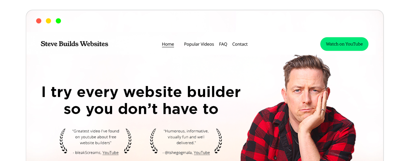
I test every website builder so you don’t have to. These are my rankings of the best website builders for 2026.
Our work is supported by affiliate commissions. Learn More
Last Updated January 7 2026
This is a massive list of the best ecommerce websites in 2026.
You’ll find a range of styles on this list — everything from minimalist designs to bright and busy designs are included.
But every single store I’ve included has one thing in common: their design moves customers to make a purchase.
I hope you find this inspiring — let’s get started!
Tip: Use ← and → arrow keys to browse.
Allbirds sells men’s, women’s, and kids’ super comfy casual shoes. They are made with natural materials like wool and offer a unique style choice.
The ecommerce site features excellent copy, really good images, and a natural flow for potential buyers. Plus, everything is optimized for conversion rates — for example, notice the navigation bar: each link is to a commercial page; the navigation to non-commercial pages like the contact or about page is placed in the footer.
They also have great remarketing in-store: Whenever a visitor visits a product page but doesn’t buy the product, they are shown those products under “Take Another Look” right at the top of the homepage (whether the visitor is logged in or not).
The Supernatural brand features an exciting, plant-based way to get creative in the kitchen. All of their powder products and recipes are vibrant in color, better for you, and fun to use in the kitchen!
The no-copy, no-CTA hero section gives the website a clean look. And the yellow-based color scheme matches with their packaging and ad & social media post colors, giving it consistent branding.
Their shop section has a lot of negative space, product image thumbnails that change on hover, and minimal captions. The product description copy is straightforward and well-structured, and each product has associated customer reviews at the bottom that add social proof.
Minna is an organic tea company selling many different tea flavors in individual cans or a variety packs. Their teas are free of the excessive sugar you’ll find in most teas yet still taste light and delicious.
The full-sized header image, the white space throughout the homepage, the CSS parallax scrolling effect, and the appropriate colorful sections…all are examples of modern-day web design trends. Also, minor details like adding nutritional facts and relevant certificates near the “Order Online” CTAs elevate the visitors’ trust in the brand.
Note : The Minna website is more like a landing page for branding. The CTAs take potential buyers to their Amazon listings.
One minor error you should avoid: The navigation text isn’t contrasting enough to the background image, so the visitors will struggle to see the “Shop Tea” link.
This is an outstanding example of using mixing photography and design. The homepage photo places the product front and center and uses green leaves to build a sense of brand. But here is what’s great: the photo doesn’t sacrifice usability at all. The navigation is still very obvious and the headline doesn’t run into the subject of the photo at all.
The design is very clean. Everything feels tight and orderly.
The typography is light and readable. Text is never too small. Occasional pops of yellow are used to call attention to buttons.
Overall, this is minimalism done right! And what’s great is it reflects the online store’s brand. They design simple and timeless products — and the website reflects this value!
Melula is a children’s fashion line from Denmark with a focus on shoes. Their collections are colorful and unique and aim to reflect the fun and imagination of a child.
They show (not tell) their colorfulness and playfulness with their minimal website. For example, the website homepage has a negligible amount of text, only a couple of menu items, and one clear CTA, “Visit our shop.” Apart from that, the page is filled with images that show the personality of the Melula brand.
Their Shop page, like the homepage, is also minimal:
Overall, Melula’s is an excellent design inspiration if you want to employ minimalism for your ecommerce store.
The Soilboy company is obsessed with plants, the benefits of owning them, and the care they require. Those with a green thumb will love the in-depth information they provide and the plants available for purchase from the website.
Inspired by and located in Kansas City, Jones Bar-B-Q is famous for its delicious flavors. The restaurant started back in 1970 and has since grown to produce sauces that can be purchased online from anywhere in the world.
For the website, they have chosen a red-based color palette for branding, so the visitors instantly connect them with something hot or exciting.
From a hierarchical viewpoint, they have an image of the freshly-made hot sauce and a big and bold text that reads “SAUCE MADE WITH LOVE IN KANSAS CITY” at the top. Then, there’s a clear navigation bar (with a CTA to their online shop) and a separate highlighted call-to-action button, “Shop Sauces.”
In short, the hierarchy leads to their store. Their store is a typical three-column store made with the Squarespace ecommerce platform.
Feastables is a chocolate bar brand created by MrBeast - one of the most popular and influential YouTubers.
Its website landing page with a semi-flat design uses the classic blue and pink MrBeast color scheme. It also has all the MrBeast elements sprinkled throughout the website - massive giveaways, philanthropy, an image of Jimmy aka MrBeast, quirky reviews from Chandler and other team members, etc.
Other than the whole MrBeast branding and modern web design, the website has snappy and easy navigation, accessibility settings, a live chat/chatbot, social media buttons, logical structure, and perfectly placed CTAs.
From a marketing-on-the-site viewpoint, they use popups and interactive spin-to-win wheels to collect emails for email marketing, they have a chatbot to increase conversion rates, and they have put average reviews at the top of each product page to give visitors social proof, etc.
Super minimalist design — lots of whitespace and room for bold photography.
The design reflects the clothes they sell: high-quality, basic essentials.
Oura is a special ring that you wear on your finger similar to a fit bit that tracks fitness, sleep and overall wellness levels. It has a body temperature monitor that assists in analyzing your levels all day and while you sleep.
Dropps sells eco-friendly detergents, softeners, dishcloths, and other laundry and kitchen products through their Shopify store.
Their website follows the template of a typical modern-day ecommerce website: full-size header image, good copy, good navigation, USPs mentioned right at the top, and minimal and relevantly-placed animations. I particularly liked the website hero image — the image itself says a lot about their products.
The Shop page displays products in one column, one below the other. Each product is sort of a separate section with mini-descriptions of the features of the product and a CTA that leads to the product page.
The homepage features a fast-moving slideshow (seriously — a new photo slides in every second) that goes between photos of women, avocado oil bottles and avocado trees. It gives a good, quick impression of who might be interested in this brand.
Oishii is a Japanese-based company featuring the Omakase Berry. The company prides itself on quality over quantity berry farming available at its locations in New York, LA, and New Jersey.
On their website, they use a fast-loading, high-quality, full-size background video for the hero section. The video showcases the freshness and the quality of the berry, which demands the visitor to react: ‘Nice! I want that!’. And as soon as you feel “I want that,” the next thing you’ll see is the CTA to their online shop.
If I took away the image, could you guess what the target audience of this website is? I’ll bet you could.
It’s light typography and muted colors immediately suggest that this is a children’s brand (and the target audience is parents).
Even on your first impression, you’ll immediately know who this product is for.
Both the photo and the text are telling you this is beef jerky for adventurers! It’s a great example of storytelling.
Soko Glam sells Korean beauty products for skin, hair, and body. You can find just about anything from body washes to makeup here at reasonable price points. This company is run by Charlotte Cho, and she loves to encourage others to think about beauty from a new perspective.
MNML is a men’s fashion line featuring modern and sleek styles with a clean-cut finish. Based in LA, they sell clothing, outerwear, and accessories with a modern twist.
Here’s a great example of using bright, bold colors. You’ll often see food-related online stores use bright, bold colors — especially for snacks, condiments and drinks.
In 2013, newlyweds Matt and Ish started the company Ocelot Chocolate right from their apartment. Their passion for organic, quality chocolate, combined with their design skills, has helped their company flourish, reaching customers worldwide.
Grind is a coffee subscription service. Customers pay for monthly deliveries of coffee pods. It’s good example of how to design an ecommerce website for a subscription product.
Malco sells wooden names that you might hang in a baby’s nursery. They even include an interactive name-designer to create custom wooden names.
The website color palette is similar to a color palette you might decorate a baby’s nursery in: soft colors and pastels. There are no bright colors used. This immediately signals that the target audience is parents.
It’s a good example of an ecommerce site that communicates a brand through their colors.
Kith is a unique company that was established in 2011—offering clothing, footwear, and more for men, women, and kids. They also have retail locations that offer build your own treats with ice cream and candy!
Here’s a great example of a product page. It’s clear and straightforward. Most stores will want a grid layout like this for product pages because it gives customers a quick overview of all the different products available.
This is the site for all things beer-related. From apparel to artwork, you can find unique pieces focusing on beer. You can also listen to podcasts and find events to be a part of if you love an ice-cold beer!
Soylent is a meal replacement company offering powders, shakes, and bars to make your healthy choices easier. They keep all items clean and focus on sustainability.
Here’s an example of an online store selling tickets for a comedy club. It’s one of the best ecommerce website design examples for an events-based business.
Wildbrand sells courses for marketers and their store has an elegant feel. The muted green background and green buttons have a kind of collegiate feel.
Selling water bottles is a competitive market! This site does a good of showcasing their bottles to potential customers with soft product photos.
Prevail Boxing is located in LA. They offer super sweat boxing sessions for different fitness levels. You can schedule classes, view pricing info, and purchase gear from the gym as well.
Selling snacks online can be difficult. Customers want to see and touch food. This is why most food websites use bright, bold colors — they are trying to give you a sense of the food!
Chinos galore for the modern man. They offer chinos in several different cuts and price points, so you’re sure to find the perfect pair for him. Their fabric usage focuses on superior comfort and functionality.
Love Billy sells clothing, jewelry, stickers, and more. In their jewelry lineup, they can give you a permanent bracelet showing commitment to the ones you love, with the option of cutting it off at some point, of course. Less intimidating than a tattoo!
October’s Very Own has both a men’s and kid’s fashion line. They have several different locations including New York, LA and Toronto. Their style is urban and fresh with super cool casual pieces.
Lyrical Lemonade is a small site selling apparel as a side to the main website that focuses on music. You can find t-shirts, hoodies, and sweats to lounge in.
Huel offers nutritional ready-to-made drinks for meal replacements and powders you can add to your own fixings. They have a flavor boost line that comes in over 8 different flavors. Their goal is to provide that extra nutrition that we often lack in daily consumption.
Find a variety of stylish and up-to-date sneakers to purchase. They carry Nike, Addidas, Pac Sun, and more. They also sell apparel with an urban vibe.
Blinkers is a shop that bike owners will appreciate. They sell blinkers for your bike, made for any weather situation that may arise. Just like your car, you can notify people of the left and right turns and create a safe space for your trip.
Here’s an ecommerce website example for digital-only products — Devon sells online courses and Squarespace plugins.
It’s also a good example of an online store with a dark color scheme.
This online store has unique and cultural pieces from around the world, ready for a spot in your home. You can find furniture, jewelry, and antiques that will surely be different than what’s available locally.
Food brands often opt for a design with bright, splashy colors. And that’s definitely what Partake does.
Check out their site for some fun hover interactions!
Ash & Erie sell apparel for shorter men. The design is casual and professional.
Vetememes sells men’s and women’s casual and fashion-forward pieces. Plenty of t-shirts are featured in their line, but they also have some cool windbreakers and bags to complete your look.
Steve Madden is a well-known footwear brand that has been around for years. You can also find handbags, purses, and clothing online in trendy styles for men and women.
Here’s a great ecommerce website example of a beauty brand. It uses big beautiful photography and lots of whitespace.
Native Union has collections for every tech gadget and issues you need to solve. Cases, charging docks, and apple watch bands are available here. The goal of their designs is to be functional and stylish simultaneously.
Sneaksa uses fun, bright colors and loud uppercased typography to set a mood for their online sneaker business.
Olivier is selling prints so this classic minimalist design works well — the whitespace frames the prints and the light typography never feels intrusive.
Pictures tell stories — and that’s exactly what’s happening here. It’s a beautiful photo that puts the spotlight on the two influencers that run the store. It gives a great first impression.
Suzie Winkle is a Paris based apparel line for the sophisticated and professional woman. There are pieces perfect for work and running errands but also robes you can cozy up with at home.
This shop sells items for the man that is strong, sturdy, and independent. You can find clothing, shoes, bags and other accessories. They also offer lifestyle goods like care products, magazines, and books.
This is a good example of a small online store. The storefront is a simple grid of prints that can be purchased.
I really like this bold minimalist design but I do have one concern: could having some much text uppercased make reading and navigating a bit tiring?
You can figure out this beauty company as it says it all in the name. Super cool skincare products that find their color from natural fruits and are infused with other powerhouses like green tea.
This clean, D2C website focuses on just one thing: Sales! The first three sections of the website focus on selling: 1. The hero section shows the best offers. 2. Below, they have a “Most reviewed” section that showcases best-sellers. 3. Next, they have CTAs for their collections. And sections below that build social proof and uplift their brand—something that compliments the goal of the ecommerce site well.
Besides focusing on the goal, it also follows the modern website design aesthetics elements. For example, it uses a great font, a suitable color palette, high-quality product photos, a hover-to-reveal-further navigation bar, and more.
Rooted Juicery sells plant-based juices. Their website is a great example of using colors and shapes to communicate a brand. Just by looking at it, you get a sense of who the target audience is.
Here’s an online store selling beach towels — and it does a good job setting the tone. It’s a clean design that showcases a big, bold photo.
One criticism? The text shouldn’t be in front of the product!
Here’s an online business that sells both services and products. I appreciate that the shopping cart remains visible even while browsing services.
Casey Neistat is a designer that offers men’s casual wear such as t-shirts and hoodies. Perfect for days at home or out and about. The styles are simple yet fun with splashes of color.
I’ve added lots of examples of ecommerce websites in this article — but what about non-profits? Here’s a non-profit that uses WooCommerce to accept donations and buy products.
I love how front-and-center the brand values are here — the first things you see are cowboy hats, a cowgirl and the store.
Farmers Friend sells equipment for market farmers. They are unique because they invent many of the tools they sell. Since these are new tools, they offer lots of educational articles and videos to sell the products.
Insteon sells wireless control products for home use. With their product line, you can control light switches and thermostats and even pair them with Google Home Assistant.
The Collective Podcast is run by Ash Thorp. He hopes to compile a large collection of podcasts focused on the balance between work and life. You can explore all of these and purchase his gear via the site.
Seven Grams Caffé has a minimalist design that doesn’t get in the way. This is great because it puts the spotlight on the star of the show: mouth-watering photos of their gooey cookies.
A minimalist site design like this works best when you have eye-catching product photography!
There are exceptions to every rule — and this online store for a music artist is a good example of that. Instead of having the navigation at the top of the website, they’ve moved it to the bottom of the website. This is a more unusual placement for navigation but it possible suits the surreal tone of the artists work.
Tonal is endorsed by Lebron James — so they put Lebron front and center on the homepage. A good example of leading with your brand story.
Here’s an example of simple, clear site navigation. The shopping cart icon is obvious (and always visible on mobile devices as well) and navigation is clear and straightforward. Makes for a solid user experience.
GearLaunch is a company that allows you to choose from a base idea such as a white t-shirt and then designs it completely. Once you are ready to launch, they take care of that and many other details for you like customer service and orders themselves.
Exotic plants that you won’t find locally. Find unique plants to care for, along with instructions on how to care for them and other valuable information.
Cupshe sells beach wear for women including swimsuits, cover ups and casual wear. They have adorable styles that you’ve probably seen advertised on Pinterest or Facebook.
Here’s an interesting example of an online store that let’s you purchase services. Jeff does book covers and you can order a cover through his online store.
Emlid offers high-end and reliable units that assist in mapping and surveying properties. It works in conjunction with an app so that you have access to it 24-7 and can make edits easily, helping businesses run smoothly.
Here’s an example of sleek modern brand. The design focusses on product imagery and clear categorization (e.g., Headphones, Speakers). The color scheme is subtle, enhancing the visuals of the products rather than overpowering them.
Here’s a minimalist ecommerce website example.
Most of the website is a simple white background with black text — punctuated by sections with a very light grey background.
Minimalism is a way to recede the website design into the background and showcase the product photography — in this case AKA is a German apparel brand.
Mile-X Equipment Inc. sells anything automotive you can possibly need. From buses to trucks, you can find air compressors, car jacks, batteries, and more. They stand by their reasonable prices for general consumers and offer supplier prices as well.
Surrounding is a modern line of home-based pieces like furniture and lighting fixtures. They carry high-end brands in their collection like Sunbrella and Ferm Living. You can visit their blog for design articles and ideas you can feed off of when choosing pieces.
Snuck Farm Shop is prioritizing their physical retail location — so they highlight it with a big bold photo in this clean, minimalist design.
This shop is jewelry galore! You can find pieces in gold, silver, and rose gold for reasonable prices and in beautiful styles. They offer necklaces, bracelets, rings, and more.
You can find a wide variety of items on ZopBuy. Apparel for men and women, beauty care, and hunting items, among several other categories. They find quality brands, then deliver them to you at great prices and with top-of-the-line customer service.
This store offers artistic and DIY items such as patches, pins, apparel, and stickers. It’s a clean and straightforward design that makes browsing through their diverse product categories easy for visitors. The site’s layout is user-friendly, showcasing their products with clear images and detailed descriptions, enhancing the shopping experience.
A decent example of an online store for travel. Though what’s with the watermarked “G” on the homepage image?
Here’s an example of a minimalist design — but I’m a little concerned that the navigation is too subtle and might be missed by some visitors.
Asolid example of an online store for apparel. Clean navigation, big bold photos and solid branding.
Here’s a sunglasses brand that doesn’t put their sungalsses front and center — instead they have user-generated content (photos from actual customers). It’s an interesting approach to put testimonials front and center!
Here’s a simple design — the homepage is simply a grid catalogue of the products. You can sort or filter them but it’s all there. Nice example of minimalism.
Oskar Gydell designs necklaces and bracelets in simple and casual pieces. Although casual, they are high quality and can endure daily wear while maintaining their appeal and beauty.
To me, this design is communicating a brand that is artsy and grungy. They are using a monospace font which is typically used in computer code — an interesting choice for an online store.
This an example of a gritty, bold design. The typography is all capitalized which makes the design feel loud and impactful. They also use a felt marker font throughout the site that gives it a DIY feel.
Another example of a simple, minimalist storefront. Strange Daze just has a two-column grid of products you can buy.
Ashley Chloe sells products that have a seamless merge between technology and fashion. They create sleek pieces like earbuds that won’t throw your entire outfit off while in use and are additionally comfortable.
Vivi et Margo sells French-inspired homewares and the design elements try to reflect this:
This is a good example of communicating brand through the design.
UNIF is a women’s trendy clothing and accessory line. Appropriate for young women with an edgy vibe. There is casual styles in footwear, bags and t-shirts among others.
StorySite has created striking done-for-you Squarespace templates that follow the StoryBrand Marketing Framework. Their simple process makes it easy for consultants, coaches, guides, and small businesses to get a professional site without having to become expert website builders. They also offer a free wireframe tool to help clients build out their content.
Magna Tiles are a very popular toy for kids. This is a pretty average product page — products listed as a grid with a sidebar for filtering.
For the dirt bike fanatics. A huge range of products is available here from helmets to replacement parts. The categorizing makes what you need easy to find, with labels like “street” or “race”, as options. From the inside out, they have everything you may need in your riding adventures.
Here’s one of the few examples of a dark and gritty ecommerce store. The screenshot is actually from the product page.
Gravity Trading is a family-owned and operated business. They have men’s, women’s, and children’s clothing and accessories. They also have a fan shop where you can buy gear supporting your favorite sports teams.
Featuring a clean, crisp design, CHRISTY is a good example of an online store for home and decor. I especially like the use of Hatton font for headings!
The website for Karmin Hair Tools features a sleek and user-friendly design, emphasizing ease of navigation for its visitors. It allows users to quickly switch currencies and languages, enhancing the personalized experience.
The Littlest Studio is a sewing blog run by Melanie. You can find a link to her Etsy shop on the site. Access tutorials on sewing and patterns to make your own creations.
A pretty typical example of an online beauty store. The site navigation drops down into lots of links to individual product pages. It’s a pretty common marketing strategy to have individual product pages targeting popular queries for search engine optimization.
To build your online store, follow these steps:
E-commerce websites should offer a variety of payment methods. For example, Apple Pay should be available on iPhone mobile devices — but wouldn't make sense on an Android phone. Website builders such as Shopify offer lots of features around multiple payment method support.
Shopify is the best ecommerce website builder. It includes everything you fundamentally need to build a successful ecommerce business. For everything else, there's the Shopify app store, where you can find 7000+ extensions to add all the functionalities you need to build your ideal store.
WooCommerce is also a solid platform for ecommerce, but you'll need some technical knowledge to build your ideal store + managing it is harder than ecommerce builders like Shopify.
For me, great ecommerce designs boil down to two critical elements: brand and usability.