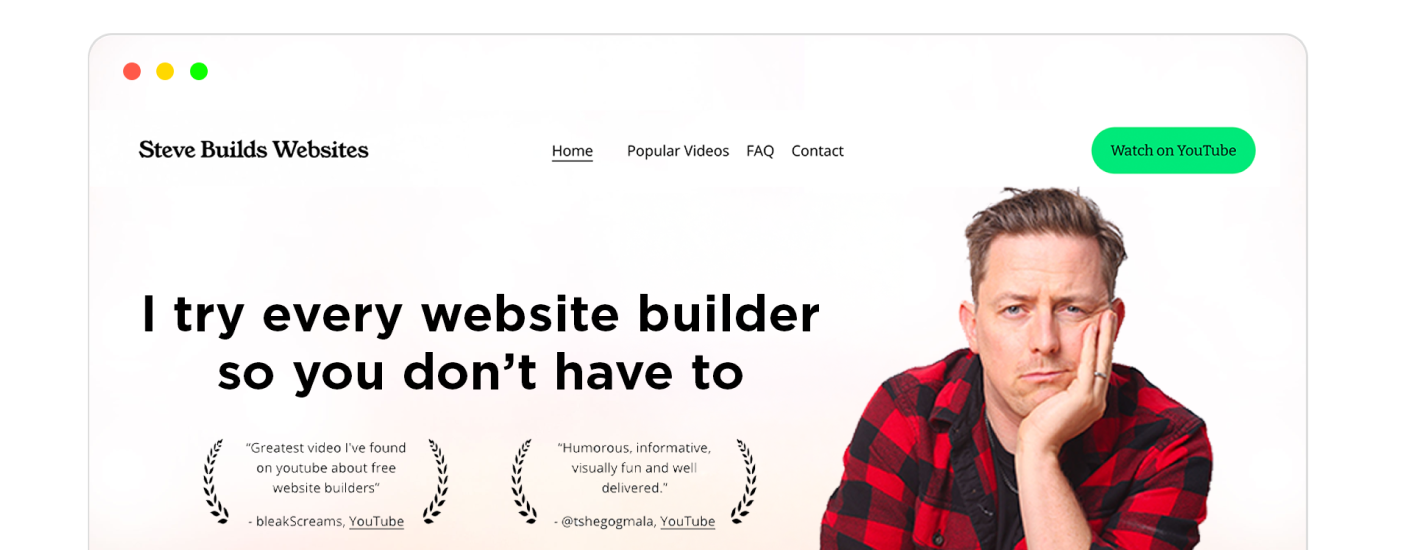
Best Website Builder
I test every website builder so you don’t have to. These are my rankings of the best website builders for 2026.
Our work is supported by affiliate commissions. Learn More
Last Updated January 7 2026
A one page website forces you to be disciplined— there’s only room for what needs to be there. This is good because small business websites often have too much content!
Most of the examples are built with Strikingly and Carrd, the two most well-known one page website builders. Of the two, I’d recommend Carrd as it’s easier to use and much, much cheaper.
Tip: Use ← and → arrow keys to browse.
Cassidy Horton is a freelance personal finance copywriter. Her website is an effective one-page site that is focused. Here are the key elements that make it work:
Overall, this one-page website effectively communicates who Cassidy Horton is, what she offers, and how to engage her without overwhelming visitors.
Daily UI is a series of Design Challenges and Surprise Rewards sent out every day.
This example is an effective one-page site because it’s simple and conversion-focused. The hero headline clearly explains the challenge, social proof from big-name companies builds trust, and testimonials add credibility. Benefits of joining are laid out in a quick scroll, with a signup form front and center. Everything is presented in a seamless, linear flow without distractions.
Thomas O’Quinn is an experienced Creative Director specializing in design strategy for people-focused brands, known for his collaborative leadership and successful track record across various industries.
Philip Källberg’s single-page website is an excellent example of a concise personal/professional résumé website. The whole website has just two things:
There’s no “CTA” because a personal website doesn’t need one, but he has linked to his important social media profiles - LinkedIn, Twitter, and ProductHunt.
Located in Virginia, Chris is a professional web application developer. In his personal, one-page website, he mentions, “I have an appreciation for the design side as well.” — and it’s clear from the simple, everything-centered web design format he chose.
Erik consults, advises, and invests in companies to make the world a more businessier place. And his single-page website tells you exactly that. The website also acts as a center for people to find his LinkedIn or email to reach out with business ideas.
Since 2008, Love Curated has been finding and sharing top inspiration, references, and resources to help designers make great websites and landing pages.
Mingjie Jiang builds digital products in the education niche. Everything about his one-page “about me” website — from font and color choice to the all-in-the-center design approach — is aesthetically-pleasing.
Also, when you hover over “Ender,” the theme completely changes, which is pretty cool:
Ben Tossell has made many successful internet projects and helps others do the same.
Cory specializes in copywriting, digital strategy, growth, and inbound marketing. His one-page website acts as a sort of online resume. The jump links to the two most important sections — My Work and Contact — are fantastic for a great user experience.
The Roma website aims to teach visitors how to make a difference for women like Cleo, the housekeeper at the center of the film Roma. This single-page website displays the sad reality of domestic workers’ lives.
From a pure website design perspective, it uses the black & white color palette and big fonts beautifully. At the top-right of the website is a CTA, which is a jump link to the section about how you can support in making the lives of domestic workers better.
Cook Collective is a New York-based shared kitchen facility.
Food entrepreneurs can get all the information they need from its beautiful one-page website. They can also book a tour by filling out a short form embedded at the end of the website.
The five-word heading — “Find your next favorite Gin” — tells visitors all about Ginventory’s business. The CTAs to the Apple App Store and Google Play Store suggest Ginventory is an app company, and this is the app’s website.
Just below the hero section, they have explained how the app works in five precise steps (with app screenshots).
*By this time, visitors know what the app is and how it works*
Then, there are some numbers for social proof. And, in the end, the CTAs to install their app…again. Simple, effective, and a perfect example of a one-pager.
SaaSHook is a newsletter by Rohit Chavane. He shares informational content for SaaS founders on reducing churn and increasing conversions.
Obviously, he knows the fundamental principle for building a high-converting landing page, and you can see all principles applied on his site if you look. For instance, the site has a persuasive copy, good hooks, solid social proof, and well-placed CTAs.
Aaron Payne’s homepage seems like a simple “about me” website at first. It has a short bio, a cool shot of Aaron doing what he does professionally (i.e., photography), and a few call-to-actions.
But that’s not the entire website! The Portfolio CTA is a jump link to a hidden section on the same page. Similarly, clicking the Contact button takes you to the hidden contact form on the page.
If Aaron had not hidden the photography portfolio section (which is further divided into two sections accessible through jump links), the one-pager could’ve overwhelmed visitors. Therefore, the website makes for great inspiration if you plan on adding a lot of content — especially visual content — to your single-page site. It also shows that you can do a lot even on a one-page website.
Japhlet Bire Attias is a Chapman Stick artist based in Mexico.
The website has all the elements of a good personal-professional one-pager: quality photos, an about section, some work samples, and contact information.
From a UX viewpoint, the jump links, animations, fonts…everything’s on-point.
YST Tuning uses a typical Weebly template well to present all the needed information. If you have the content ready, you can have such a site up and running in under 30 minutes!
As the name suggests, a one-page website has only one page and no additional pages. All the content of a one-page website sits on the same webpage.
Multi-page websites have multiple pages and subpages on the same domain/IP address. You can't access all the content of a multi-page website with a single scroll (like in a single-page website); you'll have to click on links (typically from the top menu bar) to explore an entire multi-page website.
The answer to this question is subjective. If you don't have a lot to share and just want to showcase your work, have a simple contact form, etc., then one-page websites are a good idea. But if you want to share a lot of information — which if fitted on a single page will require users to scroll a lot — then probably dividing it into multiple pages is better.
Though you can create a one-page website with all website builders, Carrd is the most suited for the task. Carrd is focused on the niche of one-page websites. Every feature and template of its is built for building great one-page websites. And it is a lot cheaper.
If you build it yourself, you can make a one-page website for as little as $9/year with Carrd. On the other hand, hiring a professional to build and maintain it will cost at least $100 + maintenance charges. This is excluding all the graphics design, copywriting, and strategy charges.