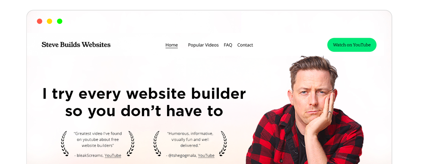
Best Website Builder
I test every website builder so you don’t have to. These are my rankings of the best website builders for 2026.
Our work is supported by affiliate commissions. Learn More
Last Updated January 7 2026
This is a collection of clean websites created with top website builders, including Squarespace, Wix, WordPress, and Webflow.
Tip: Use ← and → arrow keys to browse.
Benjamin captures some fantastic images of harsh environments that’ll give you the chills just looking at them. His work is often completed in Iceland; you can find images of beautiful landscapes and wild animals on his clean, minimal Squarespace website.
Let’s look at it from his potential clients’ point of view: Potential clients of a photographer want to see their work, contact them, or know more about them — in that order. So anything apart from those three is a distraction.
Benjamin prioritizes all three must-haves well. On his homepage is a slideshow of full-sized, excellent pictures he has clicked. Next in the visual hierarchy, you see the navigation bar. From there, you can explore more of his work and projects, expeditions, know about him, or contact him for, as he highlights, “enquiries regarding photographic & film productions, location scouting, image licensing, prints, brand collaborations or anything else.”
Scott Snyder is a product/object photographer based in Costa Mesa, California. His photography is clean-cut and top-of-the-line quality, as apparent from his clean portfolio website.
In a sense, his website is more minimal and stylish than Benjamin’s (the first website on this list). The homepage features great photos showcased uniquely with plenty of negative space; it uses easily readable fonts; the scrolling animations are on point; there’s a small ‘about me’ section; and there are appropriately placed CTAs.
However, I find Benjamin’s website better because it links to the ‘About’ section right in the menu bar. Plus, unlike Scott, Benjamin doesn’t describe his projects in-depth and lets his pictures do the work, which I find more minimal. (This is not to say in-depth project descriptions are unnecessary)
This is one of my all-time favourite examples of outstanding small business website design.
There are multiple things going on here: I love that they put a captivating photo front and center. People often think a “professional website” can’t be human. But that’s incorrect. Always put faces and people front and center when you can. People respond to people.
I also love the design element around their “expert cleaners from a trusted company” — I am not sure what exactly it signifies but it looks like it’s from an award. Little design elements like this help build trust.
Otherwise they have a very obvious CTA (call to action) and intuitive navigation. There’s an FAQ section for common questions and the website looks great on mobile devices. This is overall a great case study in small business website design.
The website design of Livso is clean and modern. The home page features a large image of a product, with a bold headline and a brief description. The navigation is simple and easy to use, and the overall aesthetic is sleek and stylish. The website makes good use of whitespace.
Saie offers clean makeup products that are inspired by customers and made with high-quality ingredients. The company emphasizes sustainability and product development to create beauty products that benefit both the user and the environment.
Its website is user-friendly with a clean, easy-to-navigate menu & submenus that offers multiple options to explore without overwhelming the visitor. Among many things, it features a link to a handy tool for makeup shade matching that helps visitors make informed buying decisions, + helps the company increase conversions and learn about its customers.
On the visual side of things:
The Supernatural brand offers an exciting, plant-based approach to getting creative in the kitchen. All of their powder products and recipes are vibrant in color, better for you, and fun to use in the kitchen!
The minimal-copy, no-CTA hero section gives the website a clean look. The yellow-based color scheme matches their packaging and ad and social media post colors, providing consistent branding.
Their shop section has a lot of negative space, product image thumbnails that change on hover, and minimal captions. The product description copy is straightforward and well-structured, and each product is accompanied by customer reviews at the bottom for social proof.
Danielle B Digital offers specialized virtual assistant and social media management services for photographers. She handles social media, copywriting, blogging, and email management, allowing photographers to focus on their craft.
The website has a user-friendly layout with clear headings and easy navigation. The clean design blends well with the muted color palette, complementing the photography theme.
Jessica Conner is a business consultant specializing in virtual assistance, business management, and operational streamlining.
The website for Jessica Conner features a monochromatic color scheme with a clean, modern design that speaks to her professional brand.
The Organised VA’s website is targeted at health and wellness professionals, offering services like podcast editing, email marketing, and general virtual assistance to streamline their operations.
The website has a clean, modern design with a refreshing teal color scheme that reflects a health and wellness vibe. High-quality images and clear, concise service descriptions make the site welcoming and easy to navigate. Its effective use of testimonials adds credibility, and the prominent call-to-action for booking a discovery call is well-placed to convert visitors into potential clients.
The website for Houseplant is clean and minimalist, with a focus on the products themselves. The background is a pale green, with white text and green accents.
Houseplant is a California-based cannabis company founded in 2018 by Hollywood actor Seth Rogen and his business partner Evan Goldberg. The company sells a variety of cannabis products including flower, pre-rolled joints, edibles, and concentrates. Houseplant’s products are available in select dispensaries in California and Colorado.
Melula is a children’s fashion line from Denmark with a focus on shoes. Their collections are colorful, unique and aim to reflect the fun and imagination of a child.
They show (not tell) their colorfulness and playfulness with their minimal website. For example, the website homepage has a negligible amount of text, only a couple of menu items, and one clear CTA. Apart from that, the page is filled with images that show the personality of the Melula brand.
Similarly, their Shop page also follows the rules of minimalist web design. For instance, there’s a lot of whitespace around the listed products.
The product description of all the listings on the Shop page is also minimal: In simple typography, they’ve mentioned a one-word name and a price for each product, and that’s it. There’s no display of reviews, no crossing the original price and showing the discounted price, no showcasing the size options, no mention of products availability, etc.
Overall, Melula’s is an excellent design inspiration if you want to employ minimalism for your ecommerce store.
Maiden Home offers furniture collections that are modern, fresh and American made. Their focus is on creating a higher standard in the world of furniture, with designer quality.
Aarron Walter is a creative team leader with vast experience. He was the fourth hire at Mailchimp, where he became the Director of UX. Then, he joined InVision as VP of Design Education, and most recently, he was the Director Of Product at Resolve to Save Lives. He is also the author of “Designing for Emotion.”
Aarron’s simple yet effective personal-cum-portfolio website shows his expertise by a) being a well-designed website and b) showcasing his work. Let’s take a closer look:
His work is unmissable: The hero section talks about the “professional him.” and has links to portfolio pages on obvious anchor texts. Just below it is the ‘A brief history’ section, which, again, leads to the portfolio pages. The same goes for the ‘My work’ section below it. He also has the links to his resume, social media profiles, and email in the hero section.
Each portfolio page shows his work, his roles, his processes, the work’s impact, and testimonials from peers. All the information follows an obvious visual hierarchy.
You can learn more about him and contact him from the navigation bar or footer links.
Gloria Lo is in Sydney, Australia, working on UX/UI design for software products. She currently works at Canva as a senior product designer. She also sings, paints, and writes.
Her website is a showcase for both her work and play. The UX work portfolio is the primary, so it’s at the top of the visual hierarchy:
Clicking on each portfolio item will take you to the corresponding case study.
Case studies are comprehensive yet never feel overwhelming. Sections are well-defined and in obvious positions. They have a screenshot of the final results at the top, then comes sections (from top to bottom): overview & Gloria’s role in the project, background info, the process & understanding the problem(s), insights, prioritization of issues, wireframing/designs, etc., ending with the results and takeaways.
You can figure out this beauty company as it says it all in the name. Super cool skincare products that find their color from natural fruits and are infused with other powerhouses like green tea.
This clean, D2C website focuses on just one thing: Sales! The first three sections of the website focus on selling: 1. The hero section shows the best offers. 2. Below, they have a “Most reviewed” section that showcases best-sellers. 3. Next, they have CTAs for their collections. And sections below that build social proof and uplift their brand—something that compliments the goal of the ecommerce site well.
Besides focusing on the goal, it also follows the modern website design aesthetics elements. For example, it uses a great font, a suitable color palette, high-quality product photos, a hover-to-reveal-further navigation bar, and more.
Snuck Farm Shop is prioritizing their physical retail location — so they highlight it with a big bold photo in this clean, minimalist design.
This store offers artistic and DIY items such as patches, pins, apparel, and stickers. It’s a clean and straightforward design that makes browsing through their diverse product categories easy for visitors. The site’s layout is user-friendly, showcasing their products with clear images and detailed descriptions, enhancing the shopping experience.
Featuring a clean, crisp design, CHRISTY is a good example of an online store for home and decor. I especially like the use of Hatton font for headings!
John Green is a The New York Times bestselling author of several books, including “Looking for Alaska” and “The Fault in Our Stars.” He is also one-half of the ‘vlogbrothers,’ ‘Crash Course,’ and several other YouTube channels with 10 million+ subscribers combined. He also hosts the critically acclaimed podcast “The Anthropocene Reviewed.”
John Green’s website elegantly showcases his published works, featuring a concise bio and his latest book on the homepage. Its clean, modern design offers easy navigation through a drawer to essential pages like his blog, YouTube, podcast, store, and contact information. Separate pages list all his books and provide access to his podcast and vlog, along with a FAQ section for those seeking insights on Green or writing advice.
This website is the portfolio of Mel Volkman, a fine artist based in Maine. It features a clean and simple design, with a focus on showcasing her work and selling prints.
For the ecommerce store, she uses an Instagram profile-like three-column template. She also showcases her photography in the Journal, where the photos are stacked one below another.
Studio Anton is a top interior design firm located in Cambridge.
The StudioAnton digital portfolio website brilliantly mirrors their design ethos. It employs a clean, minimalist layout that lets their work be the focal point, using high-quality images that showcase their expertise.
You can see their work portfolio right from the start — the landing page is the Portfolio page! You just have to hover over any of the project names on the homepage to see a full-screen thumbnail of the finished interiors
The Branch Out website employs a minimalist design that highlights a macro photo of succulent blooms and a clean navigation bar. It uses elegant typography and a nature-inspired color palette. The mission statement is prominently displayed with ample whitespace, showcasing professional photography of the landscaping work.
Smith Lawn and Landscape’s website features a clean, gallery-focused design with large project photos, minimalist navigation, and a natural green color scheme. It utilizes a responsive grid layout, allowing potential clients to explore landscaping work through project images that serve as calls to action.
In 2001, the Forever Young Spa was created. Sisters Casey and Jennifer Subject took over the business in 2019 and the spa has been booming ever since.
Stuff By Andrew Neyer is a design studio that creates simple, timeless, and whimsical products—ranging from lighting to conceptual art—crafted with a minimalist approach to help people “live brighter.”
Daisy AI is an AI-powered creative collaborator that helps you capture, organize, and develop your ideas into actionable plans using an infinite visual canvas.
The Gretel Agency supports brands in all areas of art direction, design and content. Smoothing out the kinks for new brands or recreating those that need it, they have helped a variety of different brands become more successful.
Natalie is a life coach with a community just for moms. Her website, courses and memberships offer lessons in mindfulness, allowing for a better life due to that awareness.
Ayres Vineyard & Winery is a family-run, sustainably farmed estate in Oregon’s Ribbon Ridge AVA, crafting soulful Pinot Noir and Gamay Noir that reflect the unique terroir of their 18-acre vineyard.
Felix Haas is a German designer and entrepreneur.
Revitin is a prebiotic toothpaste designed to support a healthy oral microbiome using natural, non-toxic ingredients. This is its clean ecommerce website.
Lóvi is an AI-powered skincare assistant app offering personalized routines, product evaluations, and face scanning tools to help users achieve healthier skin through science-backed guidance.
Isabell Gutendorf is a leadership and career coach based in Zurich, specializing in systemic coaching to help individuals and teams build self-awareness, navigate change, and develop resilient cultures.
Alice Liu is a UX/UI designer passionate about crafting user-centric digital experiences, with a portfolio spanning legal tech, healthcare, and architecture.
Koen Jansen is an Amsterdam-based brand and product designer with over 12 years of experience, currently leading design at Bakken & Bæck.
Plants to the Rescue is a UK-based wellness brand offering 100% organic, alcohol-free herbal tinctures that blend Ayurvedic, Traditional Chinese Medicine, and Western herbalism to support sleep, digestion, stress relief, and daily vitality.
Milamend is a science-backed wellness brand offering an all-in-one, NSF-certified supplement designed to support women’s hormonal balance, fertility, thyroid health, mood, sleep, and digestion using a blend of 14 clinically studied ingredients.
Studio Office is a versatile creative space in Denver’s LoHi neighborhood. It offers natural light, a wet bar, a 10-foot seamless photo wall, and cozy lounge areas.